Frequency of use is a better starting point than the label.
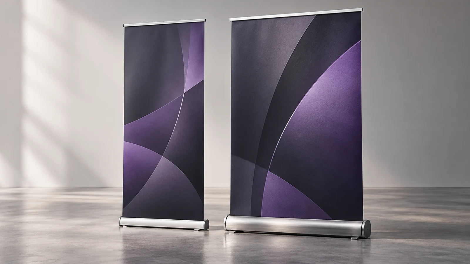
A pull-up banner combines a printed graphic with a retractable stand, support pole and carrying arrangement. Two products can look similar in a small photograph while feeling quite different during setup and transport. Budget and premium are useful range labels, but they are not universal standards. Ask what actually changes between the models in your quotation.
Begin with the calendar. Will the banner stand in one reception area, appear at a single recruitment event, or travel between exhibitions every week? Who will move it, and will they be working alone? A sensible purchase for a one-off promotion may be different from the right kit for a team repeatedly packing a van at the end of an event.
Compare at a glance.
On a smaller screen, scroll across to compare all options.
| Factor | Budget pull-up banner | Premium pull-up banner |
|---|---|---|
| Typical use to assess | Occasional campaigns or static display | Repeated travel or enhanced presentation |
| Hardware | Ask for exact housing and support details | Look for specific construction improvements |
| Graphic material | Confirm separately from stand price | Do not assume better media is included |
| Footprint | Check feet and circulation space | Check actual base dimensions |
| Carrying bag | Confirm supplied protection and handles | Compare protection rather than label alone |
| Replacement graphic | Availability and fitting vary by model | Still needs explicit confirmation |
| Artwork | Clear hierarchy is essential | Same design discipline is essential |
| Outdoor use | Do not assume suitability | Premium does not automatically mean outdoor |
| Value | Good when features match limited use | Good when extra features serve repeated use |
Budget: a practical option for occasional campaigns.
An economy stand can be worth considering for occasional use or a largely static display where the budget needs to stretch across several messages. Occasional deployment and static locations place different demands on the hardware from frequent travel and repeated assembly. The actual stand and graphic specification should still be checked.
A lower-priced unit does not have to mean weak artwork. A clear layout, suitable print file and relevant message can make an economical display work well. If the campaign is short-lived and the banner is unlikely to travel afterwards, paying for a more elaborate mechanism may not improve the audience’s experience.
The limitations may concern the housing, feet, pole arrangement, carrying bag or options for replacing the graphic. These vary by model. Do not assume that every economy unit is identical or that a low price includes the same print material as another quote. Ask to see the base and its footprint, not just the printed face.
The printed material is a separate buying decision.
Ask what media is being printed, whether it has a blockout layer and how it behaves in the expected light. A stand placed in front of a bright window has a different presentation challenge from one against a solid wall. The appearance of the graphic should be assessed together with the hardware, but the two are not the same specification.
Check whether the quotation includes the same visible width and height, print preparation and proofing. If an important image is low resolution, a better base will not make it sharper. If the text is crowded, a more expensive print surface will not give the audience extra reading time. Put the most effort into the part of the banner customers actually need to understand.
Use the supplied artwork template for the exact stand. The graphic may require material that remains inside the roller, and the top rail may cover part of the sheet. Keep essential wording inside the stated visible and safe areas. Do not resize an old file by guesswork because the new stand appears to have similar dimensions.
Design for people walking past, not a desktop screen.
The top of the banner is often the first part people see over a table or across a room. Give that area a clear business name or headline. Follow with a short explanation and one useful next action. A banner covered in paragraphs asks people to stop and read in a setting where they may be moving between stands.
Consider what will sit in front of it. A desk can hide lower content, and a queue can block important details. Put contact information where it can be seen in the intended setup. If using a QR code, provide enough clear space and test it on a full-size proof or sample at a realistic scanning distance.
For multiple banners, decide whether they form a coordinated set or must work independently. A recruitment display, product offer and company overview need distinct messages even if they share brand colours. Label the carrying bags so staff can find the correct graphic without opening every unit at the venue.
Transport and setup deserve a simple routine.
Follow the instructions supplied with the selected model. Set it on a suitable level surface, use the feet or support arrangements provided and keep it away from circulation routes where it could be knocked. Standard indoor roller banners should not be treated as outdoor signs unless the exact product is designed and specified for that use.
When retracting the graphic, guide it carefully rather than releasing it to snap back. Protect the edges and keep the stand in its intended bag during transport. Avoid stacking heavy equipment on top. A brief setup demonstration is useful when several team members will use the same kit, especially if the pole or top attachment is unfamiliar.
Inspect the stand before travelling, while there is time to resolve a problem. Confirm that the pole, bag and any model-specific parts are present. Taking an incomplete display to an exhibition can cost more in inconvenience than the saving from an inexpensive unit. Keep instructions and supplier details with the equipment.
Ask about replacement graphics before you buy.
Some systems support replacement graphics, but the method and cost vary. A replacement may require workshop fitting rather than a simple customer swap. Ask whether the hardware can be reused, what condition it needs to be in and whether the same model is likely to remain supported. Avoid promising your team that every future campaign will only need a new printed sheet.
If the message changes frequently, compare the whole replacement process. Collection, refitting and time without the stand may influence the decision. If the message is intended to last, avoid dates or offers that will make it obsolete unnecessarily. Keep the approved artwork and model name together so a future enquiry starts with the correct specification.
Examples of sensible choices for different teams.
Illustrative example: a small business needs two banners for a single local recruitment fair. An economy option may be appropriate if the display is indoors and the artwork is event-specific. Budget can then be directed towards a clear message and supporting handouts rather than features unlikely to be used again.
Illustrative example: a sales team attends regular trade events. A more robust named model, suitable carry bag and confirmed replacement-graphic route deserve comparison. The buyer should include transport and setup experience in the decision, rather than comparing only the visible printed area.
Illustrative example: a clinic wants a permanent information display beside reception. The base appearance, footprint and readability may matter more than rapid packing. Check that the chosen position does not obstruct access and that sunlight behind the graphic does not compromise the design.
Your project checklist.
- Number of events and how frequently the stand will travel.
- Indoor location, available footprint and any bright backlighting.
- Required visible size and whether a table will stand in front.
- Number of different designs and who will assemble the stands.
- Original artwork, images and the main call to action.
- Whether future replacement graphics are important.
- Event date, collection or delivery needs and budget for the complete kit.
Your questions. Answered.
Is premium print sharper?
Not automatically. Print quality depends on the artwork, media and production specification. The premium description may refer mainly to the stand hardware. Compare these items separately.
Can I use it outside?
Only if the exact product is designed and specified for that environment. Ordinary indoor pull-up banners are not a substitute for an appropriate outdoor display, even when placed near an entrance.
Can I change the graphic myself?
That depends on the model. Some replacements require specialist fitting and spring mechanisms should not be dismantled casually. Ask for the approved process before buying.
Would a pop-up display be better?
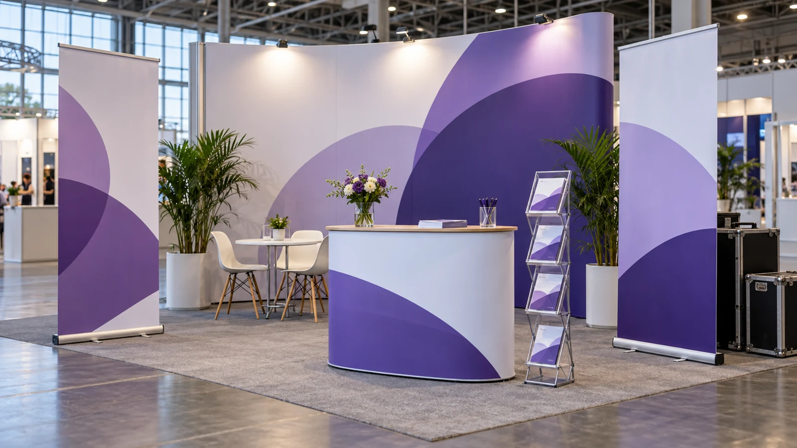
For a broader backdrop or a coordinated exhibition presence, it may be worth comparing. Start with the available stand space, transport and setup arrangements, then choose the format that supports your message.
Put the advice into practice.
Tell us where the sign will go, what it needs to communicate and the date you are working towards. Our Norwich team can discuss the design, materials and fitting around your project.
Visit our Norwich workshop ↗ · Find signage for your sector ↗