Choose the form that suits the frontage.
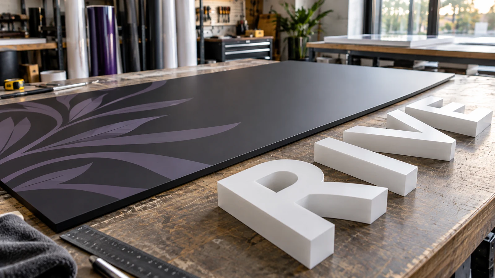
Built-up letters and flat panel signs solve the same basic problem in different ways: they identify your business. Built-up lettering makes individual characters into three-dimensional objects. A flat panel provides a continuous surface for printed or applied graphics. Either can look considered and professional when the scale, typography and installation suit the building.
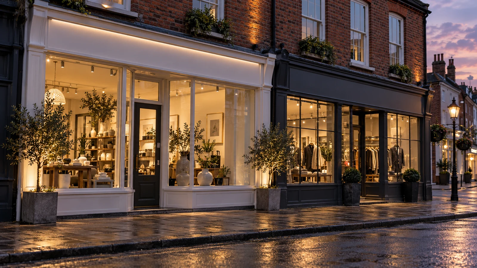
The best starting point is a photograph of the whole frontage. Look at the architectural lines, the space available and where customers approach. A large sign crowded into a narrow fascia can feel awkward regardless of its construction. Equally, delicate letters can disappear against a complicated wall. Compare both options on the same photograph before deciding that one material or format is automatically more premium.
Compare at a glance.
On a smaller screen, scroll across to compare all options.
| Factor | Built-up letters | Flat panel signs |
|---|---|---|
| Visual character | Individual dimensional characters | Continuous branded background |
| Wall visibility | Background remains part of design | Panel establishes its own graphic area |
| Complex artwork | Small details need fabrication review | Printed artwork can accommodate more detail |
| Installation | Careful character setting out and fixing | Panel support, edges and fixing layout |
| Surface preparation | Existing wall defects may remain visible | Underlying surface must still be suitable |
| Updating | Replacement may involve individual fixings | Graphic or panel replacement depends on system |
| Illumination | Available in suitable fabricated constructions | External or other designed lighting possible |
| Viewing priority | Strong wordmark and clean contrast | Clear hierarchy within one graphic face |
| Quotation detail | Materials, returns, fixings and installation | Substrate, graphics, joins and installation |
Built-up letters: depth and individual character.
Built-up lettering has formed faces and returns that create depth. It differs from flat-cut lettering, which is cut from a sheet and may be mounted directly or on spacers. Architectural lettering can combine different materials, finishes and illuminated effects. The exact construction should be chosen to suit the artwork and installation.
The appeal is often the way individual letters sit on the building, cast shadows and create a substantial identity without filling the whole fascia with one printed rectangle. This can work well for simple wordmarks with generous spacing. A logo with many small separate elements may need simplification or a supporting panel so the installation remains coherent.
Potential limits include fabrication complexity, alignment, the suitability of narrow strokes and the number of fixing points. The wall behind the letters becomes part of the design. Existing holes, discolouration or uneven surfaces will not necessarily disappear. Include preparation or making good in the brief rather than discovering it after the old sign has been removed.
Flat panels: a clear canvas for the whole message.
A flat panel establishes its own background, making it useful when the brand relies on a strong colour field, a detailed logo or a secondary line of text. It can also create a consistent visual area across an otherwise busy frontage. The panel material and edge treatment influence the finish, so compare more than the artwork alone.
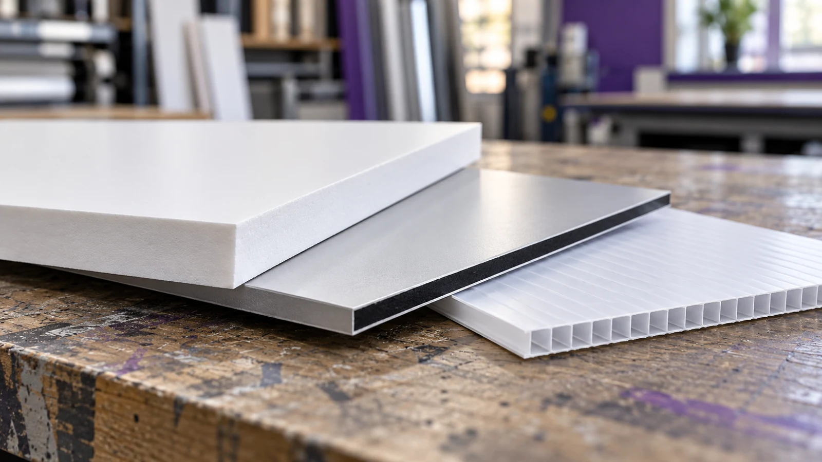
Aluminium composite is one possible substrate. The DIBOND manufacturer page explains the aluminium-skin composite construction and its use in signage. That does not mean every flat panel should use the same sheet: dimensions, environment, support and any project requirements need to determine the specification.
The main limitation is that a large continuous surface can look visually heavy if its proportion and layout are poorly judged. Panel joins, exposed fixings and edges also need deliberate treatment. A panel should not be used to conceal an unsound mounting surface. If the wall or fascia needs repair, address that before fitting the new sign.
You can combine both approaches.
The choice is not always either letters or a panel. Raised or built-up lettering can be mounted onto a designed background, creating depth while controlling the colour behind it. This can be helpful where the building surface is visually inconsistent or where a complete branded fascia is wanted.
A hybrid needs a clear purpose. Adding layers solely because more components seem more impressive can increase cost without improving the sign. Ask whether the background is solving a contrast issue, providing a neat mounting arrangement or establishing the right shape for the frontage. If it is doing none of those things, a simpler composition may be stronger.
Flat-cut acrylic lettering offers another comparison when some dimension is wanted without the same fabricated construction. The thickness, fixing method and viewing distance determine its effect. Discuss a sample of the proposed letter, including its edge and mounting, so you are comparing the finished result rather than two very different render styles.
Typography can decide which construction works best.
Bring the original vector logo if you have it. Screen images can show the appearance, but production planning needs accurate outlines and proportions. Ask how fine strokes, small enclosed shapes and separate punctuation will be made and fixed. A logo designed for stationery may need a considered signage version rather than a direct enlargement.
For panels, keep the message disciplined even though the entire surface is printable. A fascia is usually there to identify the business, not reproduce every service in a brochure. If a strapline is useful, test it at the actual viewing distance. Opening hours or detailed offers can often sit elsewhere in the customer journey.
For individual letters, check the spacing as a complete word rather than inspecting each character alone. The apparent gaps around different letter shapes can vary. Request a proof showing the entire installation and its relationship to windows, doors and fascia edges. This is especially useful when the business name includes both wide and narrow characters.
The building and access affect both options.
Built-up lettering typically needs careful setting out, while a panel needs an appropriate support and fixing arrangement across its size. Neither should be designed independently of the building. Tell us about cladding, render, brickwork, existing fascia boards and any areas the landlord says must not be drilled.
Access can be a significant part of the project. A sign above a canopy or close to a busy entrance may require different arrangements from a low-level installation with clear space. Agree the working area, customer access and timing before promising an opening date. Removal of the old sign and making good should be included explicitly.
If illumination is being considered, assess it as a separate design and installation decision. Some built-up letters can house lighting; other schemes use external lighting. Flat signs can also be illuminated in appropriate ways. Read our illuminated versus non-illuminated comparison before assuming that choosing dimensional letters commits you to a lit sign.
Examples of a useful match between format and business.
Illustrative example: a design studio has a simple wordmark and a clean, well-maintained wall. Individual built-up letters could let the architecture remain visible while giving the name depth. The proposal should show how the smaller descriptor is handled and whether the chosen contrast remains clear from the pavement.
Illustrative example: a trade counter needs its name and a concise description to be unmistakable across a yard. A flat panel with strong contrast may provide a direct, readable solution. The panel layout can establish a clear brand block without asking individual small letters to compete with the building cladding.
Illustrative example: a salon replaces an old fascia with visible repairs beneath it. A designed background with raised lettering may be worth comparing with a straightforward panel. The final choice should follow a surface inspection and a costed proposal for making good, rather than relying on a mock-up that hides the building condition.
Think about the next change before ordering.
If the name, strapline or tenant is likely to change, ask how the chosen sign could be updated. A panel graphic may be replaceable in some specifications; individual letters may leave fixing points when removed. Neither option should be promised as a universal quick change. Record the material, dimensions and installation details for future work.
For external proposals, check approvals before manufacture. Government guidance on outdoor signs explains the advertisement-control system in England. The choice of lettering or panel alone does not determine consent. Position, scale, site context and any lighting all need to be considered with the relevant authority.
Your project checklist.
- A full frontage photograph and close-ups of the existing sign.
- Available width, height and approximate installation position.
- Original logo files, preferred colours and any secondary wording.
- Whether the building background should remain visible.
- Known wall condition, landlord constraints and access arrangements.
- Daytime or evening viewing needs and whether lighting is required.
- Expected future changes to the name, tenant or supporting message.
Your questions. Answered.
Are built-up letters always more expensive?
They often involve more fabrication and setting out, but a useful comparison needs the same size and installation scope. A large complex panel installation may cost more than a modest lettering scheme. Request a project-specific breakdown.
Are flat-cut letters the same as built-up letters?
No. Flat-cut letters are cut from sheet material. Built-up letters have a fabricated depth with faces and returns. Both can provide dimension, but their edge appearance, fixing and lighting possibilities differ.
Can a panel look premium?
Yes. Proportion, material selection, colour, typography and neat installation matter more than the label. A carefully detailed panel can be a better result than unsuitable dimensional lettering.
Can you match an existing sign?
Send photographs, dimensions and any original specification. A close match may require samples and inspection. Existing weathering and discontinued materials can affect how a new component sits alongside the old work.
Sources & further reading.
Sources checked for this draft on 18 October 2026. Product ratings apply to the stated product and test conditions; confirm the current specification for your order.
Put the advice into practice.
Tell us where the sign will go, what it needs to communicate and the date you are working towards. Our Norwich team can discuss the design, materials and fitting around your project.
Visit our Norwich workshop ↗ · Find signage for your sector ↗